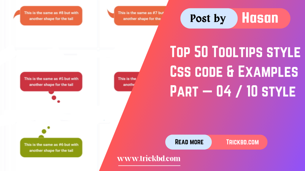
WELLCOME BACK
H
ello guys. How are you all? I hope you are all well. I came again with a post. Let’s go..


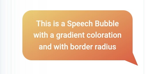
Example
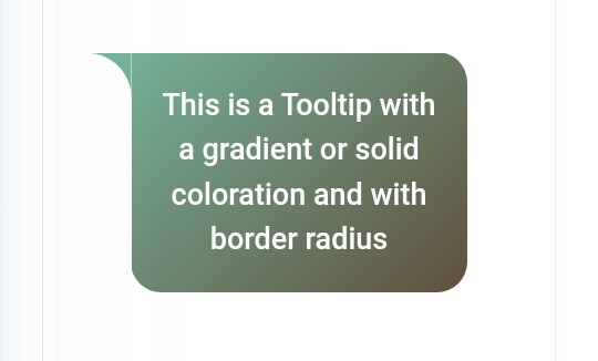
Css Code
.tooltip {
  color: #fff;
  font-size: 18px;
  max-width: 28ch;
  text-align: center;
}
.tooltip {
  --s: 1.5em; /* triangle size */
  --p: 50%; /* triangle position (0%:left 100%:right) */
  --r: 1em; /* the radius */

  padding: 1em;
  border: var(--s) solid #0000;
  border-radius: calc(var(--r) + var(--s));
  background: border-box linear-gradient(60deg,#CC333F,#4ECDC4); /* the coloration */
  --_m: 100%/var(--s) var(--s) no-repeat;
  --_p: clamp(var(--r) + 3*var(--s)/2,var(--p),100% - var(--r) - 3*var(--s)/2);
  -webkit-mask:
    linear-gradient(#000 0 0) padding-box,
    radial-gradient(100% 100% at 100% 100%,#0000 99%,#000 102%) calc(var(--_p) + var(--s)/2) var(--_m),
    radial-gradient(100% 100% at 0    100%,#0000 99%,#000 102%) calc(var(--_p) - var(--s)/2) var(--_m);
}
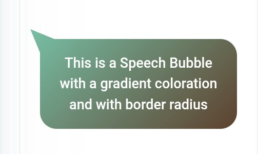
Example
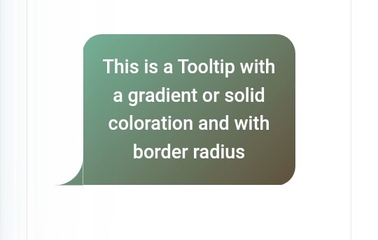
Css Code
.tooltip {
  color: #fff;
  font-size: 18px;
  max-width: 28ch;
  text-align: center;
}
.tooltip {
  --s: 1.5em; /* triangle size */
  --p: 50%; /* triangle position (0%:left 100%:right) */
  --r: 1em; /* the radius */

  padding: 1em;
  border: var(--s) solid #0000;border-radius: calc(var(--r) + var(--s));
  background: border-box linear-gradient(-30deg,#D95B43,#ECD078); /* the coloration */
  --_m: 0/var(--s) var(--s) no-repeat;
  --_p: clamp(var(--r) + 3*var(--s)/2,var(--p),100% - var(--r) - 3*var(--s)/2);
  -webkit-mask:
    linear-gradient(#000 0 0) padding-box,
    radial-gradient(100% 100% at 100% 0,#0000 99%,#000 102%) calc(var(--_p) + var(--s)/2) var(--_m),
    radial-gradient(100% 100% at 0    0,#0000 99%,#000 102%) calc(var(--_p) - var(--s)/2) var(--_m);
}
Example
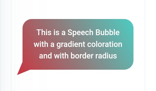
Css Code
.tooltip {
  color: #fff;
  font-size: 18px;
  max-width: 28ch;
  text-align: center;
}
.tooltip {
  --s: 1.5em; /* triangle size */
  --p: 50%; /* triangle position (0%:top 100%:bottom) */
  --r: 1em; /* the radius */

  padding: 1em;
  border: var(--s) solid #0000;
  border-radius: calc(var(--r) + var(--s));
  background: border-box linear-gradient(45deg,#490A3D,#F8CA00); /* the coloration */
  --_m:/var(--s) var(--s) no-repeat;
  --_p: clamp(var(--r) + 3*var(--s)/2,var(--p),100% - var(--r) - 3*var(--s)/2);
  -webkit-mask:
    linear-gradient(#000 0 0) padding-box,
    radial-gradient(100% 100% at 100% 100%,#0000 99%,#000 102%) 100% calc(var(--_p) + var(--s)/2) var(--_m),
    radial-gradient(100% 100% at 100% 0   ,#0000 99%,#000 102%) 100% calc(var(--_p) - var(--s)/2) var(--_m);
}
Example
Css Code
.tooltip {
  color: #fff;
  font-size: 18px;
  max-width: 28ch;
  text-align: center;
}
.tooltip {
  --s: 1.5em; /* triangle size */
  --p: 50%; /* triangle position (0%:top 100%:bottom) */
  --r: 1em; /* the radius */

  padding: 1em;
  border: var(--s) solid #0000;
  border-radius: calc(var(--r) + var(--s));
  background: border-box linear-gradient(-45deg,#5E412F,#78C0A8); /* the coloration */
  --_m:/var(--s) var(--s) no-repeat;
  --_p: clamp(var(--r) + 3*var(--s)/2,var(--p),100% - var(--r) - 3*var(--s)/2);
  -webkit-mask:
    linear-gradient(#000 0 0) padding-box,
    radial-gradient(100% 100% at 0 100%,#0000 99%,#000 102%) 0 calc(var(--_p) + var(--s)/2) var(--_m),
    radial-gradient(100% 100% at 0 0   ,#0000 99%,#000 102%) 0 calc(var(--_p) - var(--s)/2) var(--_m);
}
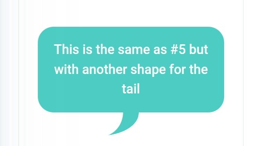
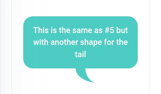
Example
Css Code
.tooltip {
  color: #fff;
  font-size: 18px;
  max-width: 28ch;
  text-align: center;
}
.tooltip {
  --s: 1.5em; /* triangle size */
  --r: 1em; /* the radius */

  padding: 1em;
  border: var(--s) solid #0000;
  border-radius: calc(var(--r) + var(--s));
  border-bottom-left-radius: 0;
  background: border-box linear-gradient(60deg,#CC333F,#4ECDC4); /* the coloration */
  -webkit-mask:
    radial-gradient(100% 100% at 100% 100%,#0000 99%,#000 102%)
      var(--s) 100%/var(--s) var(--s) no-repeat border-box,
    linear-gradient(#000 0 0) padding-box;
}
Example
Css Code
.tooltip {
  color: #fff;
  font-size: 18px;
  max-width: 28ch;
  text-align: center;
}
.tooltip {
  --s: 1.5em; /* triangle size */
  --r: 1em; /* the radius */

  padding: 1em;
  border: var(--s) solid #0000;
  border-radius: calc(var(--r) + var(--s));
  border-bottom-right-radius: 0;
  background: border-box linear-gradient(60deg,#CC333F,#4ECDC4); /* the coloration */
  -webkit-mask:
    radial-gradient(100% 100% at 0 100%,#0000 99%,#000 102%)
      calc(100% - var(--s)) 100%/var(--s) var(--s) no-repeat border-box,
    linear-gradient(#000 0 0) padding-box;
}
Example
Css Code
.tooltip {
  color: #fff;
  font-size: 18px;
  max-width: 28ch;
  text-align: center;
}
.tooltip {
  --s: 1.5em; /* triangle size */
  --r: 1em; /* the radius */

  padding: 1em;
  border: var(--s) solid #0000;
  border-radius: calc(var(--r) + var(--s));
  border-top-left-radius: 0;
  background: border-box linear-gradient(-30deg,#D95B43,#ECD078); /* the coloration */
  -webkit-mask:
    radial-gradient(100% 100% at 100% 0,#0000 99%,#000 102%)
      var(--s) 0/var(--s) var(--s) no-repeat border-box,
    linear-gradient(#000 0 0) padding-box;
}
Example
Css Code
.tooltip {
  color: #fff;
  font-size: 18px;
  max-width: 28ch;
  text-align: center;
}
.tooltip {
  --s: 1.5em; /* triangle size */
  --r: 1em; /* the radius */

  padding: 1em;
  border: var(--s) solid #0000;
  border-radius: calc(var(--r) + var(--s));
  border-top-right-radius: 0;
  background: border-box linear-gradient(-30deg,#D95B43,#ECD078); /* the coloration */
  -webkit-mask:
    radial-gradient(100% 100% at 0 0,#0000 99%,#000 102%)
      calc(100% - var(--s)) 0/var(--s) var(--s) no-repeat border-box,
    linear-gradient(#000 0 0) padding-box;
}
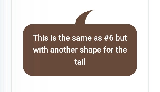
Example
Css Code
.tooltip {
  color: #fff;
  font-size: 18px;
  max-width: 28ch;
  text-align: center;
}
.tooltip {
  --s: 1.5em; /* triangle size */
  --r: 1em; /* the radius */

  padding: 1em;
  border: var(--s) solid #0000;
  border-radius: calc(var(--r) + var(--s));
  border-top-right-radius: 0;
  background: border-box linear-gradient(45deg,#490A3D,#F8CA00); /* the coloration */
  -webkit-mask:
    radial-gradient(100% 100% at 100% 100%,#0000 99%,#000 102%)
      100% var(--s)/var(--s) var(--s) no-repeat border-box,
    linear-gradient(#000 0 0) padding-box;
}
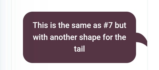
Example
Css Code
.tooltip {
  color: #fff;
  font-size: 18px;
  max-width: 28ch;
  text-align: center;
}
.tooltip {
  --s: 1.5em; /* triangle size */
  --r: 1em; /* the radius */

  padding: 1em;
  border: var(--s) solid #0000;
  border-radius: calc(var(--r) + var(--s));
  border-bottom-right-radius: 0;
  background: border-box linear-gradient(45deg,#490A3D,#F8CA00); /* the coloration */
  -webkit-mask:
    radial-gradient(100% 100% at 100% 0,#0000 99%,#000 102%)
      100% calc(100% - var(--s))/var(--s) var(--s) no-repeat border-box,
    linear-gradient(#000 0 0) padding-box;
}
THE END
S
o friends, that’s it for today. See you in another post. If you like the post then like and comment. Stay tuned to Trickbd.com for any updates.