WELLCOME BACK
H
ello guys. How are you all? I hope you are all well. I came again with a post. Let’s go..
সব কেড একসাথে চাইলে লিংক এ গিয়ে কপি করুন।
index.html
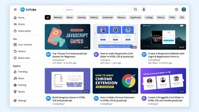
YouTube Homepage Clone
style.css
/* Importing Google Font - Open Sans */ @import url("https://fonts.googleapis.com/css2?family=Open+Sans:wght@400;500;600;700&display=swap"); * { margin: 0; padding: 0; box-sizing: border-box; font-family: "Open Sans", sans-serif; } /* Color variables for light theme */ :root { --white-color: #fff; --black-color: #000; --light-white-color: #f0f0f0; --light-gray-color: #e5e5e5; --border-color: #ccc; --primary-color: #3b82f6; --secondary-color: #404040; --overlay-dark-color: rgba(0, 0, 0, 0.6); } /* Color variables for dark theme */ .dark-mode { --white-color: #171717; --black-color: #d4d4d4; --light-white-color: #333; --light-gray-color: #404040; --border-color: #808080; --secondary-color: #d4d4d4; } body { background: var(--white-color); } .container { display: flex; overflow: hidden; max-height: 100vh; flex-direction: column; } header, .sidebar .nav-left, .category-list { position: sticky; top: 0; z-index: 10; background: var(--white-color); } .navbar { display: flex; gap: 32px; align-items: center; padding: 8px 16px; justify-content: space-between; } :where(.navbar, .sidebar) .nav-section { gap: 16px; } :where(.navbar, .sidebar) :where(.nav-section, .nav-logo, .search-form) { display: flex; align-items: center; } :where(.navbar, .sidebar) :where(.logo-image, .user-image) { width: 32px; cursor: pointer; border-radius: 50%; } :where(.navbar, .sidebar) .nav-section .nav-button { border: none; height: 40px; width: 40px; cursor: pointer; background: none; border-radius: 50%; } :where(.navbar, .sidebar) .nav-section .nav-button:hover { background: var(--light-gray-color) !important; } :where(.navbar, .sidebar) .nav-button i { font-size: 1.5rem; display: flex; color: var(--black-color); align-items: center; justify-content: center; } :where(.navbar, .sidebar) .nav-logo { display: flex; gap: 8px; text-decoration: none; } :where(.navbar, .sidebar) .nav-logo .logo-text { color: var(--black-color); font-size: 1.25rem; } .navbar .search-back-button { display: none; } .navbar .nav-center { gap: 8px; width: 100%; display: flex; justify-content: center; } .navbar .search-form { flex: 1; height: 40px; max-width: 550px; } .navbar .search-form .search-input { width: 100%; height: 100%; font-size: 1rem; padding: 0 16px; outline: none; color: var(--black-color); background: var(--white-color); border-radius: 49px 0 0 49px; border: 1px solid var(--border-color); } .navbar .search-form .search-input:focus { border-color: var(--primary-color); } .navbar .search-form .search-button { height: 40px; width: auto; padding: 0 20px; border-radius: 0 49px 49px 0; border: 1px solid var(--border-color); border-left: 0; } .navbar .nav-center .mic-button { background: var(--light-white-color); } .navbar .nav-right .search-button { display: none; } .main-layout { display: flex; overflow-y: auto; scrollbar-color: #a6a6a6 transparent; } .main-layout .sidebar { width: 280px; overflow: hidden; padding: 0 11px 0; background: var(--white-color); } .main-layout .sidebar .nav-left { display: none; padding: 8px 5px; } body.sidebar-hidden .main-layout .sidebar { width: 0; padding: 0; } .sidebar .links-container { padding: 16px 0 32px; overflow-y: auto; height: calc(100vh - 60px); scrollbar-width: thin; scrollbar-color: transparent transparent; } .sidebar .links-container:hover { scrollbar-color: #a6a6a6 transparent; } .sidebar .link-section { list-style: none; } .sidebar .link-section .link-item { display: flex; cursor: pointer; color: var(--black-color); white-space: nowrap; align-items: center; font-size: 0.938rem; padding: 5px 12px; margin-bottom: 4px; border-radius: 8px; text-decoration: none; } .sidebar .link-section .link-item:hover { background: var(--light-gray-color); } .sidebar .link-section .link-item i { font-size: 1.4rem; margin-right: 10px; } .sidebar .link-section .section-title { color: var(--black-color); font-weight: 600; font-size: 0.938rem; margin: 16px 0 8px 8px; } .sidebar .section-separator { height: 1px; margin: 10px 0; background: var(--light-gray-color); } .main-layout .content-wrapper { padding: 0 16px; overflow-x: hidden; width: 100%; } .content-wrapper .category-list { display: flex; overflow-x: auto; gap: 12px; padding: 12px 0 11px; scrollbar-width: none; } .category-list .category-button { border: none; cursor: pointer; font-weight: 500; font-size: 0.94rem; border-radius: 8px; white-space: nowrap; color: var(--black-color); padding: 6px 12px; background: var(--light-gray-color); } .category-list .category-button.active { color: var(--white-color); background: var(--black-color); pointer-events: none; } .dark-mode .category-list .category-button.active { filter: brightness(120%); } .category-list .category-button:not(.active):hover { background: var(--border-color); } .content-wrapper .video-list { display: grid; gap: 16px; padding: 20px 0 64px; grid-template-columns: repeat(auto-fill, minmax(300px, 1fr)); } .content-wrapper .video-list .video-card { text-decoration: none; } .content-wrapper .video-list .video-card .thumbnail-container { position: relative; } .content-wrapper .video-list .video-card .thumbnail { width: 100%; object-fit: contain; border-radius: 8px; aspect-ratio: 16 / 9; background: var(--light-white-color); } .content-wrapper .video-list .video-card .duration { position: absolute; right: 10px; bottom: 12px; color: #fff; font-size: 0.875rem; padding: 0 5px; border-radius: 5px; background: var(--overlay-dark-color); } .content-wrapper .video-list .video-card .video-info { display: flex; gap: 11px; padding: 11px 8px; } .content-wrapper .video-list .video-card .icon { width: 36px; height: 36px; border-radius: 50%; } .content-wrapper .video-list .video-card .title { font-size: 1rem; color: var(--black-color); font-weight: 600; line-height: 1.375; overflow: hidden; display: -webkit-box; -webkit-box-orient: vertical; -webkit-line-clamp: 2; } .content-wrapper .video-list .video-card:hover .title { color: var(--primary-color); } .content-wrapper .video-list .video-card p { font-size: 0.875rem; color: var(--secondary-color); } .content-wrapper .video-list .video-card .channel-name { margin: 4px 0 2px; } /* Responsive media code for small devices */ @media (max-width: 768px) { .navbar { gap: 1rem; } .navbar .nav-center, body.show-mobile-search .navbar .nav-left, body.show-mobile-search .navbar .nav-right { display: none; } .navbar .nav-right .search-button, body.show-mobile-search .navbar .search-back-button, body.show-mobile-search .navbar .nav-center { display: flex; align-items: center; justify-content: center; } .main-layout .screen-overlay { position: absolute; left: 0; top: 0; z-index: 15; width: 100%; height: 100vh; background: var(--overlay-dark-color); transition: 0.2s ease; } body.sidebar-hidden .main-layout .screen-overlay { opacity: 0; pointer-events: none; } .main-layout .sidebar { position: absolute; left: 0; top: 0; z-index: 20; height: 100vh; transition: 0.2s ease; } body.sidebar-hidden .main-layout .sidebar { left: -280px; } .main-layout .sidebar .nav-left { display: flex; } }
script.js
const menuButtons = document.querySelectorAll(".menu-button");
const screenOverlay = document.querySelector(".main-layout .screen-overlay");
const themeButton = document.querySelector(".navbar .theme-button i");
const searchButton = document.querySelector("#search-button");
const searchBackButton = document.querySelector("#search-back-button");

// Toggle sidebar visibility when menu buttons are clicked
menuButtons.forEach((button) => {
  button.addEventListener("click", () => {
    document.body.classList.toggle("sidebar-hidden");
  });
});

// Toggle sidebar visibility when screen overlay is clicked
screenOverlay.addEventListener("click", () => {
  document.body.classList.toggle("sidebar-hidden");
});

// Initialize dark mode based on localStorage
if (localStorage.getItem("darkMode") === "enabled") {
  document.body.classList.add("dark-mode");
  themeButton.classList.replace("uil-moon", "uil-sun");
} else {
  themeButton.classList.replace("uil-sun", "uil-moon");
}

// Toggle dark mode when theme button is clicked
themeButton.addEventListener("click", () => {
  const isDarkMode = document.body.classList.toggle("dark-mode");
  localStorage.setItem("darkMode", isDarkMode ? "enabled" : "disabled");
  themeButton.classList.toggle("uil-sun", isDarkMode);
  themeButton.classList.toggle("uil-moon", !isDarkMode);
});

// Show sidebar on large screens by default
if (window.innerWidth >= 768) {
  document.body.classList.remove("sidebar-hidden");
}

// Toggle search bar on click on mobile
const toggleSearchBar = () => {
  document.body.classList.toggle("show-mobile-search");
};

searchButton.addEventListener("click", toggleSearchBar);
searchBackButton.addEventListener("click", () => searchButton.click());
THE END
S
o friends, that’s it for today. See you in another post. If you like the post then like and comment. Stay tuned to Trickbd.com for any updates.